If you adhere to proper nutrition, then avocados are probably in ...


The combination of colors in the interior is the basis for the design of premises and especially living spaces.
Everything depends on how the right color and shade in the room is chosen! Will it be comfortable in it, how often will you have to clean it, and even if you want to sleep, eat or dance.
Therefore, it is extremely important to understand the basic principles of interior coloring, even if you started a turnkey renovation with the most eminent metropolitan designer.
We will talk about them today.
A well-known fact: up to 70% of the information our brain receives through vision.
We distinguish objects by shape, size and ... color.
We like some colors, and we categorically do not accept some. We want to surround ourselves with some, and see some as rarely as possible.
Why is that?
From the point of view of physics, color is nothing more than light waves different lengths. Their impact on our brain triggers characteristic reactions in it.
Such an impact is purely individual, but it has more or less general trends. In practice, this means that the same color (light wave) can be perceived by different people as different shades.
Remember, product descriptions on Aliexpress often state: the color may differ from the actual one, depending on the settings of your monitor?
Likewise with the eyes.

If you dig deeper, it turns out that light waves affect not only how we “think” about them at the moment of perception, but also how we relate to them. There are colors that seem bigger, more intense, more saturated to us. They are called "warm". Others, on the contrary, seem to us smaller, calmer, more inconspicuous. They are called "cold".


This feature of color perception can be advantageously used to create the interior of small rooms.

From the point of view of psychology, each of us is a walking set of stamps and personal experience, which subconsciously generates associations. It is by associative thinking that psychology explains sympathy. different people to different colors.
The color that some people associate with something good and pleasant, others evoke only the worst memories.

Let's take red for example: for someone it is associated with strawberries and summer holidays, and someone with blood and a hospital.
Associations can be enhanced if the colors are in combination - green with red or white with red.
Compare:


Sometimes associations are so strong and subconscious that our brains wishful thinking. Remember the epic with the ill-fated dress, the color of which was guessed by the entire global virtual community? That's the same.
It is important to remember the psychological background of the influence of color when choosing a color palette for the future interior. The designer should be aware of your preferences and (especially!) what is categorically unacceptable for you (it is completely optional to go into details why). It is also worth discussing this issue with other residents of the room or apartment, if you do not live alone.

There are advantages to this as well.
For example, the interior of a bedroom can and should (!) be done in such color scheme, which acts on you relaxing and soporific. Most often, this is how a light beige color palette affects a person. But there may be exceptions: if you can only fall asleep in complete darkness and silence, give preference to the interior of the bedroom in dark colors.
Bright rich colors can provoke appetite, so it is appropriate to use them in the interior of the kitchen. But a strict black and white color scheme stimulates brain activity, which is why it is most often found in office interiors.

The choice of color and even shades for the interior is also important because in many ways it is the color that can become the main argument in choosing stylistic decision. The dark range of natural colors is typical for the loft, and the light white-lavender one is for Provence. Bright and juicy colors will look appropriate in the interior in high-tech, eclectic, fusion, pop art styles, and natural woody shades - in classic, country, eco.

It often happens that in the wake of a trend, it becomes fashionable to carry out the interior in some style or in some color. But do not forget that in the pursuit of fashion, you can easily lose yourself. What everyone likes in a row may turn out to be an inappropriate and uncomfortable solution for you. And the interior is not a dress, you can’t change it in half an hour. So is it worth the risk?

Attempts to explore and systematize colors were first carried out by Newton. It was he who made the first color circular model, which was based on 7 colors of the rainbow.
Surprisingly, it is a fact: Goethe became a follower of Newton in the study of colors and drawing up the color wheel. And not some random namesake of the great poet, but personally the author of Faust. We will not stir up the milestones of his biography and find out if he made mystical deals for the sake of this discovery, but we will simply be grateful that it was Goethe who identified 3 basic colors - blue, yellow, red - in the process of mixing which other (secondary) shades appear : green, orange, purple and all sorts of their variations.

The universal circular color model, better known as the Itten color wheel or circle, is a color scheme that uses primary colors, secondary and tertiary, that is, those that were formed by mixing the first two.

The Itten circle is a must have for every newbie colorist, but many famous designers stick with it even with a rich and rich experience in interior design.
The color wheel is a lifesaver for those who are not naturally gifted as a colorist. The main rule for choosing colors that are ideally combined with each other is: combine with each other or colors from the same sector (relevant for a monochrome interior of an apartment) or from one row of intensity (relevant for a polychrome interior of an apartment). We will talk about the types of color combinations in the interior below.

For the laziest or insecure people, designers have developed entire tables of color combinations.
The point of these tables is not to bother and just use shades that already perfectly match each other.
The most common color combination tables are the palettes of the Pantone Color Institute. Every year, it is this organization that chooses the main color of the year and develops whole catalogs of color combinations for it.
(You can read more about the main color of 2018).
Pantone tables look like this:


Competitors in the field of creating color combination tables are all kinds of paint manufacturers (for example, DULUX). This is a huge plus, because by choosing the right base color, you can easily find the perfect pair for it. As they say, in the same place, at the same time.
If you tend to be image-inspired, then a more creative option would be to use photo-based color schemes.
It is believed that if the picture looks harmonious, then all the colors on it are ideally combined with each other.
Like it or not, you can check on illustrative examples:


There are several key color combination schemes.
A combination of several similar shades, smoothly flowing into each other.
On the color wheel, it looks like this:

As a rule, such combinations are often found in nature and are recommended for decorating the “quiet” spaces of an apartment (bedroom).
A combination of contrasting colors. In the color wheel, such shades are located in opposite sectors. This combination works best in a bathroom or bathroom, where there is little space for using a multi-component color scheme, but the muted shades do not play a significant role.


The combination of three shades is considered a classic and the basis of the basics of color. It is used in most living spaces in the apartment - in the living room, in the bedroom, in the kitchen.


In the color wheel, a triangle is used to combine three shades. It may or may not be equilateral. In the second case, the third shade is usually used as an accent.


Polychrome interiors are most often used for nurseries. They are bright, rich, multi-layered, which is due to the peculiarities of the child's psyche and children's worldview. In the color wheel, shapes such as a square, a rectangle, and other polygonal shapes can be used as a scheme.


The cleanest and light color, which is often used in the interior as the main one or as a binder for other shades. One of the basic colors of the Provencal style. A few years ago it was very popular “in its pure form”, but today designers are increasingly converging on the need to combine it with bright saturated shades.


It became popular in interior design not because of the famous “50 shades”, but solely because of its depth and versatility. Typical for loft, hi-tech, minimalism, industrial styles. Became in demand after the entry into fashion of raw concrete textures. It goes well with bright warm shades.


Black is a classic. Appropriate in almost all styles of interior design. Along with white it is combined with all shades. Often used as an accent color, but in recent years there has been a growing trend to choose it as the main color of the interior. It is quite practical for decorating a bedroom and a living room, but in rooms with water (kitchen, bathroom, toilet) difficulties may arise due to white soap stains on black surfaces. Not recommended for use in a nursery.


The hottest and most dynamic color. In high concentration, it can be perceived as too aggressive, so it is recommended to use it as an accent. Appropriate for modern and bold styles - high-tech, eclectic, fusion, pop art.


One of the most rarely used shades in the interior. In temperament and dynamics it is very similar to red. Saturated shades of orange are often used in kitchens, bathrooms, bathrooms, children's rooms. For such rooms as the living room, bedroom, hallway, designers tend to choose softer and more muted colors: peach, apricot, coral, salmon.
Orange as the main color is very characteristic of the loft style. However, only one of its shades is allowed to be used: brick.


Sunny and cheerful - this is how you can characterize the yellow color in the interior. Most popular in the design of children's.
Yellow is in perfect harmony with both a warm palette of shades and a cold one. Visually, it greatly increases the temperature of the room, so it is not recommended for decorating rooms on the south or east side of the house.


A color associated with harmony, nature and tranquility. Known for its relaxing effect in general and on the eyes in particular. Recommended for design educational institutions. It is believed that the interior, made in shades of green, helps a person to reboot, get inspired and get a charge of vivacity and energy. Allowed in the design of ALL living spaces. Most often used in classic and eco style.


Gentle, playful and even somewhat infantile shade. Up to 90% of bedrooms for girls are decorated in it. It is combined with white, gray, black, red, purple flowers. Used in Provence, Rococo, Glamor, Pop Art and Art Deco styles.


Blue is the new black. Like grey, it is deep enough and versatile enough to be universally used in all living spaces. It is allowed to be used in the design of rooms in any style, but is most typical for Provence, marine style, eclecticism, hi-tech, art deco.


In 2018, one of the shades of purple was recognized by experts from the Pantone Color Institute as the color of the year. Purple is a rather unusual and unusual color for decorating apartments in the post-Soviet space, therefore it is perceived as intriguing, mysterious, and creative. Characteristic for modern interior design styles. Combines with yellow, pistachio, orange, white, gray, black.


The universal color of natural wood, which makes it the main color classic interior. It is considered neutral in all respects.


A softer and more sophisticated version of brown. Unobtrusive, pleasant, soothing color. Very often used in the interior of apartments and (especially!) In bedrooms. Perfectly complements and emphasizes most of the shades used in the interior. Most often used as a base color in combination with gray, brown, blue or black.


Guys, we put our soul into the site. Thanks for that
for discovering this beauty. Thanks for the inspiration and goosebumps.
Join us at Facebook and In contact with
Complementary, or additional, contrasting, are colors that are located on opposite sides Itten's color wheel. Their combination looks very lively and energetic, especially with maximum color saturation.
The combination of 3 colors lying at the same distance from each other. Provides high contrast while maintaining harmony. Such a composition looks quite lively even when using pale and desaturated colors.
A combination of 2 to 5 colors located next to each other on the color wheel (ideally 2-3 colors). Impression: calm, relaxing. An example of a combination of similar muted colors: yellow-orange, yellow, yellow-green, green, blue-green.
A variant of a complementary combination of colors, only instead of the opposite color, the colors adjacent to it are used. The combination of the main color and two additional. This scheme looks almost as contrasting, but not so tense. If you are not sure that you can use complementary combinations correctly, use separate-complementary ones.
A color scheme where one color is the main one, two are complementary, and another highlights the accents. Example: blue-green, blue-violet, red-orange, yellow-orange.
When developing interior projects for their house or apartment, the owners will certainly face the issue of choosing colors and shades in which this or that will be finished. In many ways, it is this factor that becomes decisive in achieving harmony and creating a certain “mood” in the design of the room. And when choosing, of course, it is desirable to be guided not only by momentary impressions, but also by the experience gained by professionals in this field.

The combination of colors in the interior of the table and the options obtained in practice - all this will be presented in this publication. We hope that the information received will help the reader to decide on the choice not only of colors in the design of housing, but also of style directions, since these factors are closely interconnected.
It has been scientifically proven that a comfortable psychological atmosphere in the house and the positive emotions of the residents depend on the color direction of the interior, since it is it that affects the human condition. And the selection of color combinations is not such an easy task, subject to certain rules developed by professional designers in collaboration with psychologists. Based on such developments, tables were compiled to help determine the choice of the appropriate option.

Interestingly, in the vast majority of cases, designers did not have to invent anything on their own when compiling such tables. The ideal harmony of combinations already exists in nature - you just need to be able to “open your eyes”, see and highlight the right shades that complement and even enrich each other.
Unfortunately, not all people have the art of choosing the right color scheme. Compiled tables and the so-called color circles allow you to visually evaluate this or that combination.
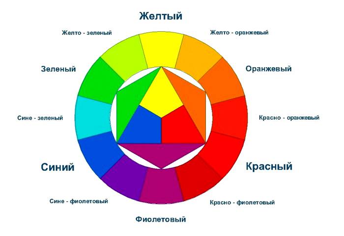
To begin with, let's deal with the structure of the color wheel shown in the illustration below. Three tiers are clearly distinguished on it in the direction from the center to the periphery.
The main or primary are three colors, since it is from them that all the rest are composed - these are blue, red and yellow. They are placed in the center in the form of triangles.
The result of their pairwise mixing is shown in the second tier:

The third level of the circle shows the tertiary colors, which are obtained by mixing the primary (red, blue and yellow) with the secondary (violet, green and orange). Those colors that are obtained as a result of such mixing in various proportions are just used in interior design, creating fabric patterns, painting, etc.
Colors such as white, gray and black are not represented in the color wheel, since they simply do not exist in nature in their pure form. But when decorating interiors, they may well be used both as basic and to create additional shades.
In the interior, pure colors are rarely used in large quantities. They, as a rule, can only set the general color "mood" and serve as accents in the form of separate elements - it can be an armchair, pillows, a bedspread on furniture, sometimes curtains. For the main design, complex shades are used, which are the result of mixing several primary and secondary colors. They are chosen for painting walls, floors, selecting furniture upholstery, etc. It is these interiors that most homeowners like to create a cozy and psychologically comfortable atmosphere in their possessions.

The presented diagram shows several options for the main combinations of various colors:
- every third color of the outer circle;
- along a rectangle or rhombus inscribed in a circle.
AT this case, colors are taken that will be well combined with each other - red is harmonious with blue, yellow and green, blue goes well with yellow, and sometimes green.
Based on these principles, dozens of different combinations of different shades are formed. There are also remote pairs, as well as four colors that can be combined with each other, which expands the selection options.

The colors in the circle change in saturation from light to dark. Therefore, by choosing a sector with a certain color, you can pick up several shades from it that differ in tone. This combination of shades in the interior is called monochrome. To enliven the design or emphasize certain elements in the design, universal colors are used - white, gray, black, and sometimes red, depending on the chosen style direction, creating a certain mood and purpose of the room.
Pick up the shades of colors yourself - quite difficult task. Therefore, it is easier to use ready-made tables created by professional designers. However, in order not to make a mistake in the selection of colors, you need to know how to use them correctly.

The color selection tables show various shades, which are in harmony with each other and are used for interior decoration. As a rule, one block is made up of five or six colors. The first color in the block is the main color, the second and third are additional - they "support" the first one. The remaining shades are accent, that is, they are used to revitalize the interior.
An important role in the selection of colors is played by the chosen style of the interior. This factor will be discussed in more detail in a separate section of the publication.
Designers divide all colors into warm and cold, they are presented in the following table:

It should be noted that sometimes the line between warm and cold shades is barely perceptible.
If a decision is made to independently choose a color scheme when performing cosmetic repairs in an apartment or house, you must adhere to several recommendations for choosing warm and cold tones:
Those who do not have the desire to select the desired variant of the tint range by color blocks can use the hint that the following table gives. It presents the most used primary colors in interiors and options for additional shades that go well with the first, as well as those that harmonize poorly with them.

The table is easy to apply when choosing a color scheme for decorating a room. It is enough to take colored pencils or sit down to a computer with a graphics editor installed, and, looking at the recommendations, create your own color block. The first thing to do is to determine the main color, and then select shades that are in harmony with it - here you can already rely on your preferences to a certain extent (more precisely, within the recommended limits).
Do not forget that when creating the color scheme of the interior, all objects and objects without exception participate in it. decorative elements. Therefore, not only the color of the walls, floor and ceiling is selected, but also furniture accessories, as well as textiles - furniture upholstery, curtains and decorative pillows, bedspreads and blankets. In this case, to help novice designers and those who decide to decorate their homes on their own, a table was compiled to help colors of furniture and accessories that harmonize well with each other. The last column in the table represents shades that are not recommended for use with a particular furniture color.

It has long been proven that colors affect mood and, in general, the entire psycho-emotional sphere of a person. Some of them are pleasing or soothing, while others, on the contrary, act depressingly, can irritate or cause inexplicable anxiety. Therefore, choosing one or another light direction in decoration, you should carefully study the recommendations of psychologists. This is especially important when it comes to decorating a child's room.

This table presents the most popular colors in interior design and their shades and describes the emotions that they can evoke.
| Illustrations with examples of interiors | Color and its influence on the mood and psyche of a person. |
|---|---|
 | Red color has an irritating effect on the human psyche, it can cause a feeling of anxiety. Therefore, in its pure form, it is most often used only to bring expression into the interior, in the form of contrasting accents. If you place a red pillow or a blanket in a boring, almost monophonic interior, it will immediately enliven the room. However, it is not recommended to oversaturate the design with red. The traditional red color for the walls is for living rooms made in the English style. |
 | Natural shades of yellow and green colors are able to cheer up, instill peace and tranquility. Green shades relieve fatigue from the eyes, and also dispose to relaxation and relaxation. Therefore, they are well suited for decorating bedrooms, kitchens and children's rooms. These colors are also used in those rooms whose windows face the north side. |
 | Pastel beige and yellow shades contribute to the creation of coziness in the room, lead to peace of mind and evoke a sense of calm. Pastel colors are well suited for almost all rooms, especially if they are decorated in one of the classic styles. |
 | Turquoise and blue color. These shades create a feeling of freshness and lightness, dispose to calmness and promote easy falling asleep. These colors are good for bedrooms and children's rooms, especially if they are located on the sunny side of the house. |
 | Orange and juicy yellow. Colors create a warm atmosphere and comfort, stimulate active areas of the brain, cheer up, tonic effect on the whole body, increase appetite. Accordingly, colors can be used as primary or as bright accents in the children's rooms, living room, as well as in the kitchen. |
 | Dark blue is used in combination with other close to it or, conversely, contrasting colors - gray, blue, yellow, etc. Dark blue should not be used as the main color, as it will visually reduce the room, but at the same time will not add any coziness or warmth to it. It can be applied along with the above colors and their shades in the living room or bedroom, if the color matches the chosen one. general style decoration of the premises. |
 | Gray color and its shades can be chosen as the main ones for the living room or bedroom. They balance the mood and do not cause irritation. However, if you use only gray scale, then the room will look boring and uncomfortable. Gray shades go well with almost all colors, so the choice of "revitalizing" additions will depend on the preferences of the owners of the apartment, as well as on the chosen style of interior design. |
 | White color serves as an excellent background for any interior design ideas - it is always freshness, cleanliness, neatness and order. However, the oversaturation of white brings a certain coldness into the interior and deprives it of comfort. |
 | Black color is able to emphasize certain elements of the interior and serve as an accent in the design of the room, made in bright colors. However, choosing this color as the main one is strongly not recommended. It may well make the room “gloomy” and will have a pressing effect on the psyche, causing fatigue and mental anxiety. |
Having mastered the basic skills of combining colors, you can experiment using the main color and a few additional shades. To do this, you will have to apply imagination and your own taste preferences. The task is simplified by the fact that now the user has at his disposal a lot of graphical applications that allow, at the design stage, to weigh how successful the conceived option is.
It should be noted that, as such, the concept of “correct color combination” does not exist. It would be more correct to talk about successfully and unsuccessfully selected colors. The latter break the harmony, introducing into the interior a feeling of constant disorder and some kind of sloppiness.
Next, options for selecting the color design of residential premises will be presented, indicating the shades used in them. In the same way, you can draw up your own project for a specific interior. This takes into account the color of not only permanently installed or applied to the wall decorative design elements, but also the plants used for decoration.
This interior design solution is made up of contrast. The main, dominant color in the project is deep dark blue, and supports it Brown color in which some furniture accessories are made. In contrast with them, there is one of the shades of yellow - in this case, close to the natural color of mimosa. This color is obtained by adding to pure yellow not a large number brown tint.

In addition to the main ones, gray and pale turquoise, almost white tones are included in the color scheme, bringing freshness and lightness to the design.
Wall murals are fixed on the wall of dark blue color, the background on which are gray-turquoise shades. The mimosa branches stand out clearly in the background image, supported by a bouquet of branches in a vase set on the table. This combination is used to form a spatial effect. In contrast to the dark walls, a light, voluminous carpet due to the high pile is laid on the floor, adding light and comfort to the room. Its light gray shade harmoniously echoes the background of the photo wallpaper.
The center of the composition is an armchair upholstered in mimosa color - it attracts the eye in the first place. The harmony would not be complete if the designer did not use such a simple element as a decorative pillow thrown on an armchair. In its design there are all the colors used in the interior. Thus, it would seem that an insignificant decorative element combined the entire color scheme. In addition, vases, a lamp and other decorative elements that complement the interior design were used as balancing color accents.
This decorative interior design solution is aimed at creating a cozy home environment. The main, dominant in this case, the white-blue color is chosen, in which the ceiling and walls are made. Thanks to this shade of white, the room visually expands its boundaries.
The rich gray color adds depth and coziness to the interior, it has a pouf-footrest installed between the sofas, which have white upholstery, adding a certain “weightlessness” to the massive furniture.

A light-colored carpet with a dark patterned pattern maintains the spatial direction intended by the designer.
Despite the small number of bright warm shades, they involuntarily come to the fore, enlivening restrained tones and making the room cozy.
The darkest of the colors used for decoration is red-brown. It is framing and used in furniture accessories, as well as cornices for curtains.
In general, this design solution cannot be called expressive. It rather encourages rest and relaxation.
Despite the fact that the main color in this interior is pale beige, the main role in it is played by a bold combination of quite bright shades of purple and grassy green.

This color scheme of the design cannot be called soothing or pacifying. Rather, this combination of shades will invigorate the owners of the bedroom in the morning. However, bright shades are used only in non-stationary interior accessories - a bedspread on the bed and curtains on the window. That is, they can be easily replaced with other colors that will drastically change appearance interior. It is this solution that gives scope for color experiments.
So, this interior, if desired, can be completely changed to discreetly soothing, for example, using not a light purple bedspread, but its beige version, reviving the design only with bright decorative pillows.
Dark brown color, although not coming to the fore, is a balancing, giving weight to the design. So, it is mainly used for furniture accessories, and the only exception is framing a picture on the wall at the head of the bed.
This color solution is close to the style that is quite popular all over the world, able to make any room cozy and conducive to relaxation. No wonder it is used specifically for the design of the bedroom. However, this approach can be successfully used for the interior of the living room.

The main color in this color scheme is white. The second supporting shade is pastel beige, close to cold. The walls of the room are made in it, and it is also used in textiles. One of the revitalizing ones is the color "coffee with milk" - it is used in the design of curtains, for framing decorative pillows and paintings placed at the head of the bed.
The cold gray-blue color, although it occupies the penultimate place in the table, is one of the main ones in this interior, as it is intended to enliven it. It is used to decorate pillows, a table lamp and paintings, which together form a composition that resembles a carpet. Without the use of framed paintings, the interior would look, frankly, empty.
There is not much brown in the design, but it also plays its important role in it - it complements the composition with dark accents. Some furniture accessories are made in it, and it is also used in small quantities in the design of picture frames.
A surprisingly deep combination of shades close to each other is used in this interior. However, it is made in cold colors, more suitable for rooms whose windows face the sunny side at home, otherwise the selected shades will make the room gloomy and uncomfortable.

The main color in this color scheme is a gray-blue pastel color - the walls of the room, a delicate patterned carpet and some furniture accessories are made in it. Supporting for the main color is its darker deep shade, it is used for individual elements of the interior. So, a knitted pouffe adds coziness to the room, without which the design would be incomplete.
The most important role in the color solution is the light blue color, which enlivens and ennobles the design. A darker blue, as well as black, are used in the interior to weight its individual areas, as well as framing elements. An unusual carpet with a knitted ornamental pattern, which is in perfect harmony with the pouffe, as well as a cover for a small stool, gives the room comfort.
This is a compilation summer lung colors that are well suited for decorating verandas, as well as rooms country houses. The main one in this selection of colors is an almost white with a slight blue hue - the window frames are painted in it, which in this case are part of the interior design. This is due to the fact that for the presence of a large amount of natural light in the room there are no curtains. This option is good if the windows of the veranda are in the shade of tree crowns, otherwise it will overheat on a hot summer day.

In this case, colors of different shades close to each other are used for decoration, thanks to which harmony reigns in the interior, echoing the atmosphere of the street. Although a delicate blue tint is chosen as the main one in this solution, green colors of various tones stand out at first glance at the decor of the room. Exactly green color Helps create a calming mood and rest the eyes.
The style chosen for decorating the veranda is also close to Provence, and proof of this is wooden plank, painted white, matched to the shades of decorative pillows, the shape of the backs of chairs, as well as window frames separated by numerous lintels.
The general mood of this interior is lightness, freshness and comfort. It's nice to spend on such a veranda free time for your favorite book or for tea.
The choice of colors for decorating a living room can be called the most difficult, and it largely depends on the style in which the interior will be made. This project features a classic English style, in which a pastel brown shade is chosen as the main one - it is used to decorate the walls. For their decoration, wallpaper with an ornamental pattern traditional for this style was used.

Supporting colors for the main hue are selected colors close to it of a darker and lighter tone. The horizontal surfaces of the room are left light - the ceiling with a classic wide frame ceiling plinth and flooring. In addition, a light plain carpet with a long pile was chosen for the floor, which makes the room brighter. The dullness of shades close to each other is diluted with juicy green blotches, as well as a blue-violet color used for upholstery of armchairs and a floor lamp with a large lampshade. These items are placed in the room in such a way that they balance the distribution of colors throughout the room.
Refreshing interior factor is an English fireplace white color, which becomes the center of the composition, attracting the eye.
Green accents are also meant to dilute the dark deep tones. They are hardly noticeable, and yet they play an important role in the displayed interior.
The choice of colors for decorating the kitchen is also not an easy task. This is often caused by the fact that in such a room it is difficult to avoid various fumes, high humidity, appearances on the walls greasy spots, especially in the work area. Therefore, for the kitchen, first of all, you should choose materials that are easy to clean, and the colors should be such that small dirt is still not immediately evident.

This color design project is made almost entirely in warm shades. True, with their dilution with a small amount of a chilly pastel turquoise color, which, at first glance, is almost invisible, but at the same time plays an important role in the interior.
The main color in this project is the white-gray color in which the ceiling and apron are made. working area imitating brickwork. Looks good against his backdrop. wall cabinets color close to coffee, but softer. Harmonizes with them and the peach shade used to decorate the cabinets located under the countertop. Thanks to him, the kitchen is filled with comfort and light.
The textile elements of the kitchen room, as well as the chairs, have the same light cold turquoise shade, which gives the interior a special “taste” of cleanliness and freshness.
Another version of the design of the kitchen, radically different from the previous one with its brightness.

Although the main color in this project is a white-blue hue, the main one is still juicy turquoise, in which the facade of the whole is painted kitchen set. It gives the room an invigorating mood and brings light notes to it. The apron and the rest of the wall, along which the tabletop is installed, have an interesting pattern made in white and turquoise tones. This ornamental design brings the right amount of comfort to the design solution.
The main color is used for flooring and carpeting, making the room look brighter.
Yellow color is used to create accents in the interior, which are dishes, a table vase, as well as other decorative and functional elements kitchens.
This kitchen design project is made with high-tech elements and. They are given out not only by the "industrial" color scheme, but also by such details as imitation of a brick wall, metallized surfaces or shades close to them.

As you can see from the color scheme, it is the steel color that is put in the first place, in which the facade of the kitchen set is made, which stands out well against the background of a brick wall of a darker, but also steel shade.
The dining table is made of two materials corresponding to the styles mentioned above - metal and glass. The chairs shown in the project are intentionally different configuration and performed in different styles, which is typical for a "loft", for which dissimilar pieces of furniture are assembled.
The floor covering is made in black, against which the steel shades stand out well. In addition, this coloring makes the “lower tier” of the interior heavier, making it more solid.
The accent in the blue-gray metallic design is a bright crimson color, which makes the interior warmer and more interesting.
Not everyone will like this color scheme, as it looks a bit gloomy. However, it is quite possible to revive it by adding contrasting colors. Fortunately, the main shades go well with almost any bright splashes.
* * * * * * *
Now, knowing what to rely on when developing your own project, you can experiment by making several options, executed in different colors. With this approach, it will be easier to avoid mistakes and end up with exactly what both the developer and all members of his family will like.
The publication will be completed by a video selection of interiors, which demonstrates a lot of successful and not very, but in any case - interesting combinations of colors. Perhaps this will give the reader some ideas of their own.
We will send the material to you by e-mail
Choosing the right color palette is essential when decorating any space. So we'll talk about ways to combine colors in the interior and the effect of color on a person's mood. We will also see how the color combination table in the interior can help in self-planning the design of the room.
The color scheme is an important component of any interior.
It is necessary to know not only the meanings of each shade, the ability to correctly combine tones is important. To apply optimal color combinations in the interior, a color wheel and a design table are used.

Before learning about the options for combining shades, let's learn about their meanings in our lives. According to psychologists, they can have an impact on our mood and even our emotional state.
The color that gives a cheerful mood and warms with warmth is yellow. Green is considered the color of cheerfulness, freshness and health. Lilac tones symbolize renewal, while blue has calming properties. Orange is perfect for the living room, as it symbolizes joy and cheerfulness.
You should not use a significant amount of brown tones when decorating a room, only in combination with others, as it causes depression. Do not abuse red, which acts excitingly. Light grayish tones are more suitable for an office, as they indicate composure and rigor.
Designers presented and formulated several concepts related to combinations of shades. The table here has been created with the standard view of palette usage in mind.

You can use the following combinations:

When working on a solution, do not forget about incongruous colors. Black and purple do not look at all, such a tandem will only visually reduce the space. It is tasteless to combine burgundy with dark green. You can not use gray with orange and green. Milky and beige shades do not fit black at all.
Useful information! Companion colors from the table must be selected individually in each case.
In addition to the color combination table, the color wheel is used in the interior. With its help, the most suitable solutions are selected. The circuit is divided into two components - cold and warm. The latter option includes shades such as yellow, brick or orange. And the cold part is blue, purple and green.

The table allows you to identify which color combinations can be used in the interior. A photo original ways presented on the site. Particular attention should be paid to the ratio between coloring components and shades.

In the kitchen area, by the way, there will be rich, deep and colorful shades. An interesting option yellow and blue palette nautical style. Cold gamma relaxes, reduces appetite and gives freshness. A warm color palette stimulates digestive systems, increases appetite and invigorates.

When choosing a palette for the kitchen, achromatic interiors are rarely used. It is grey, white and black. This option can be smoothed out with a juicy accent.

In chromatic designs, a palette is a combination of multiple hues. First you need to figure out the base tone, and then think about a suitable environment for shades. For the kitchen, you can offer the following options:

The colors for the living room are chosen according to the preferences of the owner of the room. The main thing is to observe a harmonious combination of colors.

Preference should be given to those design options that meet certain parameters:


Useful information! Terracotta shades are considered joyful and sunny. This color palette includes brown, carrot, brick and dark yellow tones.
When working on a combination of colors in the interior of the bedroom, keep in mind that you can not use more than seven shades. The best option is to choose two basic shades, for example, for the floor and walls, and all other items are selected according to tone, but can be darker or lighter.You can choose a classic design for the bedroom. In this case, coffee, beige and milky tones are used.

Terracotta, white and gray shades are suitable for style. To decorate a bedroom in a Mediterranean style, turquoise, blue, sand and yellow shades are suitable. Provence style involves the use of pink, green, blue and gray shades.

When decorating your home, you will inevitably encounter the need to correlate several colors with each other. There are several basic rules, knowing which you can easily equip any room. The article presents a table of color combinations in the interior, as well as many useful tips and theoretical materials. In this article, you will learn about:
We wish you a happy reading.
Each designer knows the basics of color interaction, and if you decide to design an apartment yourself, you should also understand this.
There are aromatic colors, these include white, black, gray and chromatic. The chromatic circle is a diagram that consists of the primary colors red, blue and yellow. By mixing primary colors, secondary tones are obtained.
The main shade and those that are formed from it are called related, there are four groups: yellow-green, yellow-red, blue-red and blue-green. They harmonize well with each other, as they consist of an admixture of the same primary colors.

In adjacent quarters there are related-contrasting shades, their combinations allow you to get the richest range. If you combine colors located through one sector, then they usually cause discomfort. Opposite each other in the quarters of the color wheel are contrasting colors. Their combination is used when it is necessary to draw attention to a certain place in the interior.
Since color affects the psycho-emotional state of a person and the biochemical processes in the body, in rooms with different purposes, the combination of shades in interior design will be different.

Particular attention should be paid to the choice of palette when decorating such rooms as a bedroom and a children's room, as they are intended for relaxation. With the wrong design, a person will not be able to relax normally, both physically and psychologically. Below is a table of color combinations in the interior, compiled by our designers.
| Room name | Recommended palette of color combinations |
|---|---|
| Kitchen | Soft and calm tones: yellow turquoise. |
| Hallway | Tones that enhance mood and digestion of food: green, beige, yellow, silver, as well as their combination with red and blue. |
| The combination of colors in the interior of the living room | Neutral, soft tones that are diluted with bright accents. |
| The combination of colors in the interior of the bedroom | Pastel colors and shades of purple. Please note that the bedroom is a personal space, so there are no restrictions, and it is made out at the request of the owners. |
| Bathroom | Light colors with a bluish tint, as they give a feeling of freshness and purity. |
Professional designers know how to choose the right palette of color combinations in the interior, so their work looks attractive and harmonious. To do this, they use a tool called the color wheel. What is it?
It is called the conditional representation of the visible spectrum sunlight, which denotes various options colors. Various theories have emerged over the years, so there are several circles:

In the sectors of the circle, the shades are placed almost in the same order as in the spectrum of visible light, and for a bunch of extreme tones, a conditional purple hue is additionally used.
For a better understanding of the correct compatibility, it is necessary to build a color wheel. A person distinguishes three basic tones: yellow, red and blue. All others are obtained by mixing the main ones with each other, as well as the main and derivative shades. By mixing the primary colors, composite ones are obtained, and the remaining empty cells are filled with tones of the third order.
Everything that surrounds us has its own color, and each tone has a certain effect on the body. The color wheel has several parameters and according to one of them it is divided into cold, warm and neutral. Next, let's talk about the combination of colors in the interior, a photo of tables with shades is attached.

Most often, the circle is divided in half, all shades of yellow are perceived by us as warm. They subconsciously evoke a feeling of warmth, coziness and comfort in a person, therefore they allow you to create a pleasant and hospitable atmosphere in the room. We associate such tones with summer. As a rule, this is:

All shades that are close to blue are considered cold. They are associated with winter, help to create a feeling of coolness and freshness in the room, seem clean and distant.

Shades that do not make a person feel warm or cool are called neutrals. If they are located next to warm or cold shades, they smooth out their effect and make the color softer.

This whole classification is conditional, pure colors can only be found in the picture, in nature they smoothly transition from one to another, so red can be both warm and cold.
When creating a certain design, you need to take into account not only your wishes, but also know and fulfill certain rules. Only in this way will you be able to properly arrange your premises and prevent serious and gross mistakes.
Before you study the layouts of color combinations in the interior, we recommend that you pay attention to the main points of the correct design design:

Each style has its own color scheme for combining colors in the interior. The table below reveals all the recommended shades when decorating a room.
| Style name | Recommended Shades |
|---|---|
| Classical | Different colors, but must be white. |
| Provence | Blue, pink, light milky. |
| Eco - style | Brown and dirty green. |
| High tech | White, black and metal color. |
| Baroque | Any pastel colors. |
| Modern | Green, blue, brown-beige. |
| Minimalism | White black. |
| Pin-up | Yellow, pink. |
| Loft | Green, red, orange, blue. |
| Country | Light yellow, brown, sandy. |
| Futurism | Light green, white, ultramarine, lemon yellow. |
Color plays a huge role in creating an interior, with its help you can create comfort and coziness, visually increase or decrease the space, so you need to take such a question as a combination responsibly.
This option is considered universal. Classic shades are used, these include beige, gray and white. By combining these tones with others, you can create a classic solution that will always look modern and beautiful. In this case, you will not need to constantly change the interior of the room when buying new furniture, replacing flooring or other elements.

The use of three primary colors that are always harmoniously combined with each other and can be used equally. The combination of red, blue and yellow causes a surge of emotions and cheerfulness. If they are used in their pure form, then a bright and saturated solution is obtained. If you use halftones, then the design of the room is less aggressive and more comfortable.

The use of a triad helps to fill the room with energy, so this solution is used for decorating the living room, sports facilities and children's rooms, and this design is not recommended in the kitchen or bedroom.
This option involves the use of 2-3 types of shades, which are located side by side in the color wheel. You need to choose the appropriate one in which you decide to decorate the room and choose several tones in the color wheel to the right or left of it. This solution is simple and original, and picking up two or three similar colors is easy.

With a complementary combination, contrasting shades are used, they are located opposite each other on the color wheel. With a separate-complementary solution, instead of the color opposite, choose the shade that is next to it. This allows you to create contrasting solutions, but they are not as intense as with a complementary combination.

In this case, the scheme consists of the main color and there are two more that complement it, and the fourth serves to highlight the accent. This creates a rather interesting effect that evokes positive emotions. Basically, such colors are preferred by young people or people who are in constant motion and fast rhythm.

The gradient in the interior is modern solution used for the design of various residential premises. It is based on a smooth transition from dark to light tone. This method can be used in the design of various interior details.
The gradient effect helps bring freshness and excitement into the room. Usually designers use different shades of blue, as it gives a beautiful combination of colors in the interior.

To create a comfortable and cozy space in the room, it is important to choose the right color solutions when decorating the ceiling, floor and walls. With the help of a competent combination, you can even breathe light and air into a small room, and make a large room warmer and more comfortable. Further in the article is another table of color combinations in the interior, which will help you choose the design of different places in the room.
| Floor, wall and ceiling design options | Recommended Solutions |
|---|---|
| Contrasting combination | The walls are made in bright colors, the floor is dark, and the ceiling is light. You can visually change the size of the room, hide the existing flaws and highlight the advantages. |
| Actual Gradient | The ceiling is light, the walls are a little darker and the floor is dark. The transition from dark to light tones allows you to create harmony, this design is suitable for any room. |
| Light and air | The walls and ceiling are light, the floor is dark. Suitable for small rooms with low ceilings. |
| Opposites | The ceiling is light, the walls are dark, the floor is light and vice versa. This option can be used in rooms with low and high ceilings. |
Studies have shown that color affects a person's mood through his subconscious. Perception is influenced by such factors as the state of health, age, social status of a person and his character.

Women are more sensitive to the perception of color and shades. There is no clear distinction between “male” and “female” colors, since each person is individual. Despite this, there are tones that women prefer more:

With age, color preferences change, women prefer pink more and green is less preferred than when they were younger.
It has been found that men perceive approximately 30% less shades than women. Often women are outraged that men cannot appreciate their efforts when choosing a color, but this is due to physiology, since for them pumpkin and peach colors may not differ from each other.

Most men prefer blue and its different shades. Some scholars believe that they symbolize it with clean water and clear sky. In addition to blue, men love green, but unlike women, they prefer colder tones. Traditionally, they love black, and most men cannot stand purple and pink.
Newborn babies see everything in black and white and only after 2 months they begin to distinguish other colors. At the age of 2-5 years, they can already distinguish the entire visible spectrum. 
Children are attracted to everything bright, so they love pink, red, yellow tones, such preferences last up to 10 years, after which the child may already like the blue tone and all its shades. Girls prefer pink, purple, while boys prefer blue and its shades.
In most cases, textiles are bought when the room has already been renovated and the furniture has been arranged. In this case, when choosing the right fabrics, there are many difficulties that affect the combination of colors in the interior. Curtains and wallpaper, as well as furniture, are much easier to pick up at the same time.

If you choose furniture and textiles, first decide on the basic shades that will prevail in the interior. Combination is in vogue now gray color in the interior and purple. In this case, the furniture can be gray, the curtains are best beige with a pattern of gray or purple hue, decorative pillows they are made from the same fabric as the curtains, and the carpet is also taken in the same color.
The procedure for selecting the color of furniture and textiles will be as follows:

This is a conditional algorithm and each designer can develop his own, but if you are new to this business, then be guided by the described technology and you will be able to properly design your home design yourself.
There can be no categorical answer to this question. Modern fashion is distinguished by extravagance and creativity. If earlier the combination of green in the interior and red was considered tasteless, now you will not surprise anyone with this.

When creating a classic interior, experts do not recommend combining cold and warm tones, but there may be small bright inclusions. If you want to combine contrasting colors, then do it better with halftones.
Consider 10 interesting facts about the influence of color in interior design:


AT brown tones

In the recreation area

city apartment


Cool blue tones

In red color

Relax zone

In a room with a fireplace

In a country house

Green shades

In the cottage

In the kitchen

In the photo room

cozy atmosphere

If you adhere to proper nutrition, then avocados are probably in ...


Pizza can be cooked not only with meat products - sausage, sausages and ...